Most people judge a wall calendar in the first two seconds of picking it up, and that judgment is almost entirely about materials. The snap of a heavier cover, the way a photo sits on a coated page, whether the binding lies flat against the wall or curls away from it: these are the details that separate a calendar that feels like a keepsake from one that feels like a giveaway. If you are ordering in bulk, the paper and binding you specify will do more for the finished impression than almost any design choice, so it is worth understanding what the options actually are.
Two decisions that define the feel
Every calendar comes down to two paper questions asked twice, once for the interior pages and once for the cover: how heavy, and what surface. Weight is measured in the United States in pounds, but the pound figure is only meaningful within a category, because text weights and cover weights are measured against different sheet sizes. That is why an “80# text” page is far lighter than an “80# cover,” even though both say eighty. Converting to grams per square meter, the metric that measures actual mass, makes the comparison honest and is the fastest way to know what you are really getting.
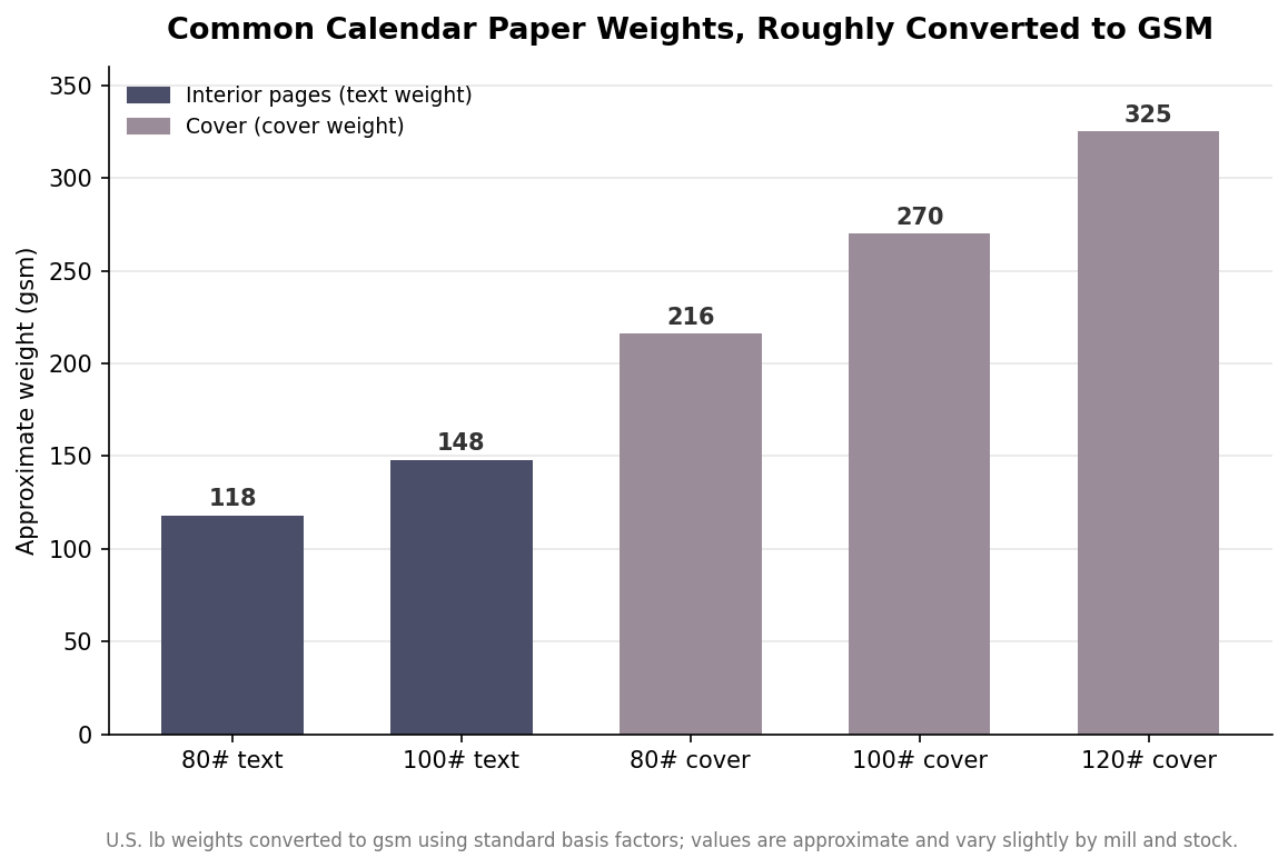
As the conversion shows, interior text stocks cluster in the range of roughly 118 to 148 gsm, while cover stocks jump to somewhere between about 216 and 325 gsm. The practical takeaway is that the cover should always be noticeably heavier than the pages. A cover printed on the same stock as the interior feels flimsy and tends to sag on the wall, while a proper cover weight gives the calendar structure and protects the pages behind it.
Interior pages have to do two jobs
The interior of a wall calendar is asked to do two things that pull in opposite directions. It has to reproduce photographs or artwork cleanly, which favors a coated surface, and it has to accept pen or pencil for appointments and notes, which favors an uncoated one. A fully coated gloss page makes images pop but resists most inks, so anything written on it smears or beads up unless you reach for a permanent marker. A fully uncoated page takes writing from any pen but renders images a little flat and dull.
The elegant answer is coated one side, often written C1S. This stock is coated on the face that carries the image and left uncoated on the reverse, so a common layout puts the photo on the coated top half of a spread and the writeable grid on the uncoated section. If your calendar is purely decorative and nobody will write on it, a full gloss or satin coated text stock is the better choice for image quality. If people are meant to actually use the grid, either C1S or a quality uncoated stock will save you complaints. Decide how the calendar will be used before you pick the surface, because this is the choice most often gotten wrong.
Coatings and protective finishes
Beyond the paper itself, a calendar can carry an added finish, and it helps to separate two categories that are easy to confuse. The first is the paper’s own coating, gloss, satin, or matte, which is part of the sheet and sets how ink sits on it. Gloss delivers the most saturated color and sharpest contrast, matte gives a softer, glare-free look that many corporate calendars prefer, and satin splits the difference.
The second category is a protective layer applied on press or after, most often on the cover. A UV coating adds a hard, shiny or matte shell that resists scuffing, scratches, and fingerprints, at the cost of writeability, so it belongs on covers rather than on grid pages. A soft-touch laminate gives the cover a velvety, low-luster hand that reads as premium and hides fingerprints well. For calendars sold at retail, shrink wrapping protects the whole product on the shelf. None of these change the calendar’s function, but they change how durable and how expensive it feels, which matters when the calendar carries your brand into someone’s kitchen or office for a full year.
Binding and how it hangs
Binding is where wall calendars differ most from other printed pieces, because the calendar has to open flat, turn cleanly twelve times, and hang square against a wall for months. Three methods dominate, and they are not interchangeable.
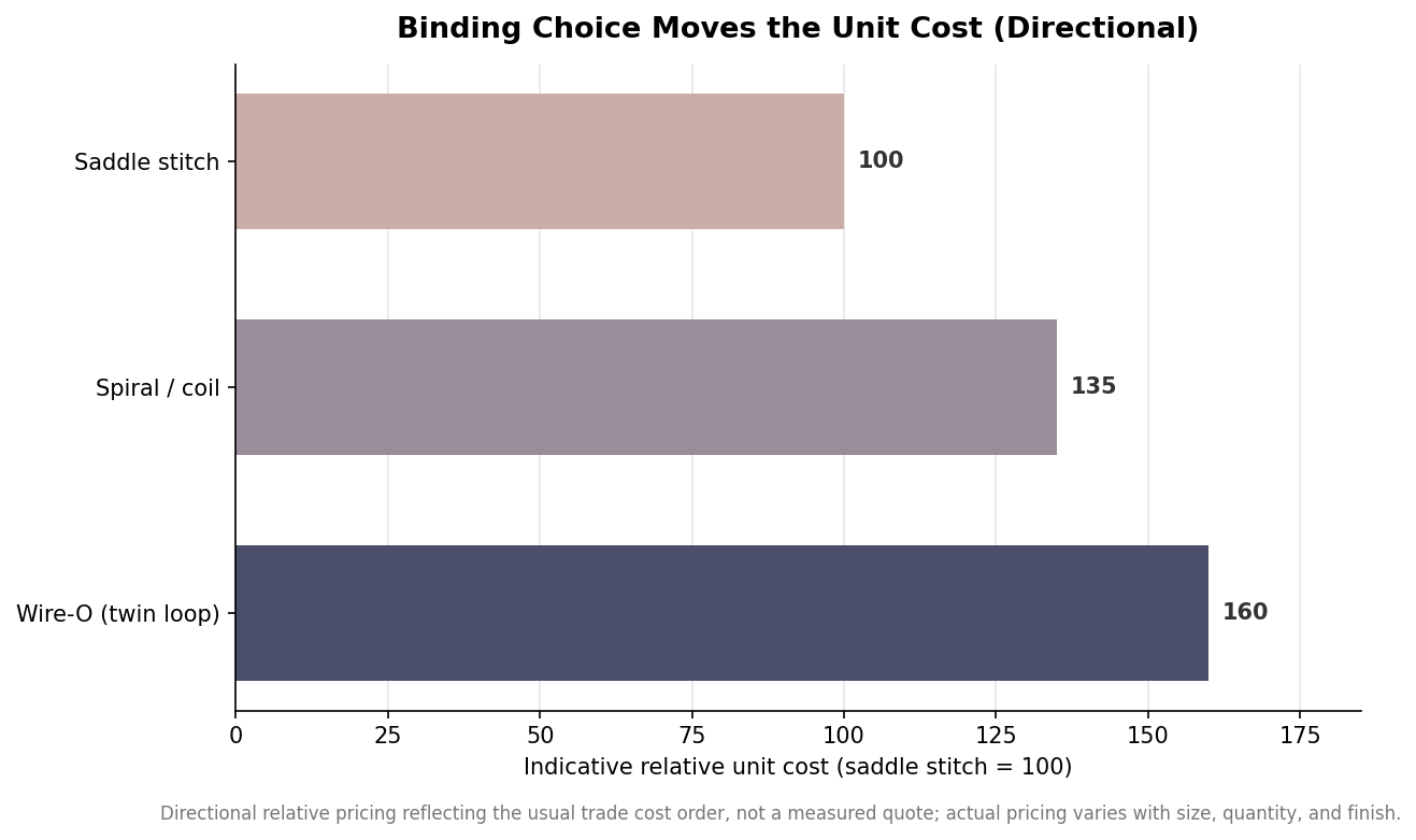
Saddle stitch, where folded sheets are stapled through the spine, is the most economical option and lies flat, but its page count has to be divisible by four and the staples can loosen with a year of monthly flipping. It suits smaller and lighter calendars more than large display pieces. Spiral or coil binding, a continuous plastic coil through punched holes, is durable, turns easily, imposes no page-count rules, and is a dependable workhorse for wall calendars that will be handled regularly. Wire-O, or twin-loop, binding uses a double-loop metal wire that gives the most professional, upscale appearance, lies perfectly flat, and rotates a full turn, which is why it is the usual pick for corporate gifts, though it costs the most and is slightly more rigid than coil.
The relative cost figures above are directional rather than a quote, but the ordering is consistent across the trade: saddle stitch is the budget choice, coil sits in the middle, and Wire-O commands a premium for its finish. Hanging is the other half of the equation. Most calendars use a single centered hole punched through the top for a nail or hook, while coil and Wire-O versions can include a formed metal hanger that keeps the calendar sitting flush and square. For a heavier calendar, a proper hanger rather than a bare punched hole is worth the small addition, because it prevents the top edge from bowing away from the wall.
A sensible default spec
If you want a starting point that works for most bulk orders, a widely used and reliable combination is a 100# gloss or satin text for the interior pages paired with an 80# to 100# cover, coil or Wire-O binding depending on budget, and a UV coating or soft-touch laminate on the cover only. Move the interior to C1S or a quality uncoated stock if the grid is meant to be written on, step the cover up toward 120# for a premium keepsake feel, and choose matte over gloss if the calendar leans corporate and understated. Get those few decisions right and the calendar will look and feel the part on the wall for the full twelve months, which is the entire point of putting your name on it.